Summary:
Communicating the value and creating a digital platform for a B2B real estate agency along with brand guidelines.
Client:
Stone Realty LLP is a real estate agency based in Mumbai that connects builders with a large network of brokers by an exclusive mandate.
Goal:
Achieving brand authority for Stone Realty in front of prospective clients – by having an informative digital brochure. I had to achieve a consistent outlook for the brand with my team at Zenoholics.
Audience:
Builders in Mumbai and Navi Mumbai. Problem – they struggled to sell their flats and manage the commission paid out to brokers. Lack of end-to-end marketing service from the process of listing the flats for sale to closing the deal was a pain point for them.
Solution:
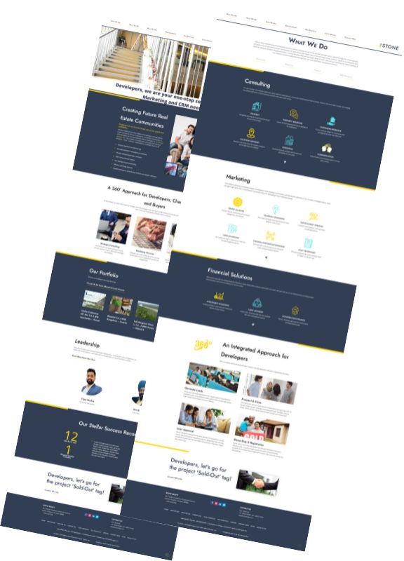
The logo was created with two key elements – yellow stones signifying the foundation while the blue lines signifying the mountain of growth. We decided to keep the entire website design with yellow lines (since it is a lighter tone that does not steal much attention) and use the blue text as the predominant colors.
I summarized the message of exclusive mandate business into the core idea of ‘creating the future real estate communities’ where there was a network of digital marketers, offline brokers and home buyer network to ensure rapid coverage across the home buyers.
I identified the three key things developers wanted to know while deciding if Stone Realty was the right firm to do business with – and accordingly crafted content for those pages with my team at Zenoholics.

In the footer’s CTA, I used the hook of ‘sold-out tag’ to appeal to the main problem faced by developers – which was a large number of unsold flats left in their inventory.

We built this website on WordPress CMS and Divi theme – designing all the elements from scratch to stay consistent with the design guidelines.
Challenges:
- Absence of a clear brief to start from – the founders were too overwhelmed with their work and couldn’t spend time communicating effectively with us. Since this was a new niche for me, I learned everything from scratch – by talking to their team members, and understood the market segment and the processes by talking with their competitors.
- Time crunch and lack of human resources – they wanted the website within one week. I worked extra hours with a small team to pull this off.
Highlights:
The standard yellow line was a huge differentiator from competitors with generic websites. Trust among their clients skyrocketed, and they closed 2 new exclusive deals with two large real estate players within 1 week of making the site live.